Skip to content
Liv Design Ltd
  • Home
  • About
  • Work
  • Blog
  • Contact
BrandingHow toLiv Design

How do you design a good logo?

Posted 4th October 20194th October 2019 LivForever748
Iconic logo design examples

As with any design process, there are no hard rules, but there are a few things you should bear in mind if you want to make your logo look professional. If you follow these simple ten steps you should be able to design a fantastic and iconic logo:

1. Make it eye catching

How do you draw the attention of clients and customers? How you your logo be different form others in your market?

2. Memorable

What makes you different from your competitors? What is going to make your company stand out? Think about the logos that you’ve seen – which ones instantly spring mind, and why?

3. Character

Is your brand fun or serious? Are you forward facing or traditional? Be individual. Don’t just copy elements from other logos that you’ve seen: yours will end up looking like a parts-bin mash-up. Be bold and don’t be afraid to stand out. Do something different.

4. Representative

A logo is the symbol for your business, your product or service and should help to demonstrate what you do, what you stand for, your approach or outlook. It is the cherry on top of your brand. The design should relate to what you are about and how you work.

5. Clever

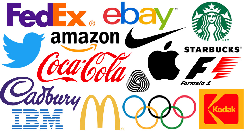
Don’t be too obvious. Add a visual twist or a hidden message. Bring in an extra level of meaning to make the viewer smile and take note. Amazon and FedEx are great examples.

6. Icon or typographical

Does a word say more about your brand than an icon? Don’t feel forced to add an image if it’s not right. Keep it text based. If you do use words only though, make it work harder by editing it. Subtle changes to a letter, like cutting an ascending/descending character or flipping a character, can make a huge difference.
7. Kiss

‘Keep it simple, stupid’… Think less is more. Some of the best logos are the simplest. Don’t try and add lots of detail. A logo will have to be used very small at times and across a variety of media so keep it legible. 

8. Colour

Cool colours such as greys and blues are often used for clerical and medical brands while warm colours – reds, yellows and oranges – are seen as passionate, wild and fun. Green is associated with the environment. What would work for your brand? 

9. Font

A modern product or brand would work better with a similarly styled font. Sans serif fonts tend to look more modern, while serif fonts (those with decorative strokes or ‘feet’ at the end) bring a traditional feel, though it depends entirely on the typeface. A handwritten font adds a personal touch. Try and mix things up.

10. Be brave

Don’t be afraid to do something different. Do you want to blend in with the competition or stand out? Break the mould. Be bold.

BrandingGraphic designLogoLogo design

Post navigation

⟵The third novel from Scott Johnson, ‘The Silent Winters’, is now available
What logo design trends can we expect to see in 2020?⟶

Search

About Liv Design

Liv Design offers inspired thinking, a fresh perspective, creative design and brand implementation to all companies, from small boutique businesses to global brands.

For design agencies, marketing teams and internal studios I also offer freelance design.

Contact

Email
scott@liv-design.co.uk

info@liv-design.co.uk

Mobile
07875 696147

Twitter
@scottlivdesign

LinkedIn
scottlivdesign


Hours

Monday—Friday: 9:00AM–5:30PM

Calendar

October 2019
M T W T F S S
 123456
78910111213
14151617181920
21222324252627
28293031  
« Apr   Jan »

Registered in England and Wales number: 6003424

VAT registration number: 895 2196 81

Registered office: Old Police Station, Church Street, Swadlincote, Derbyshire  DE11 8LN (do not use for correspondence)

SITE MAP

  • About
  • Blog
  • Contact
  • Home
  • Work

Categories

© 2025 Liv Design Ltd. Proudly powered by Sydney