A few significant logos and rebrands from 2019
2019 was a difficult year for many companies both in the UK and abroad. Brexit, conflict, environmental concerns and a global downturn all added to the social and economic strains. Despite the turmoil, companies still need to advertise and promote their services and products. A new logo and rebrand will help keep a company relevant and noticed. Here are a few designs that caught my eye and suggest what trends we can see more of during 2020.
Boots
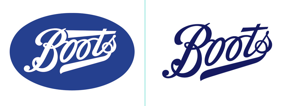
Boots is one of the leading pharmaceutical and health & beauty retailers in the UK and a familiar sight on the high street. Boots recently introduced a new, yet subtle, brand identity. London based Coley Porter Bell took on the challenge of making a trusted, valued and well-recognised brand look less dated and dated and old-fashioned.
At first glance they look similar but note the lack of flourishes, the thinner lines and use of space.
The company needed to retain its roots in healthcare but reflect the ongoing move into wellbeing and lifestyle. Boots now say that the brand identity now proudly says ‘our confidence inspires your confidence’.
Summary: retain the heritage, lose the background shape and holding devices, simplify, modernise the colour.
Mastercard
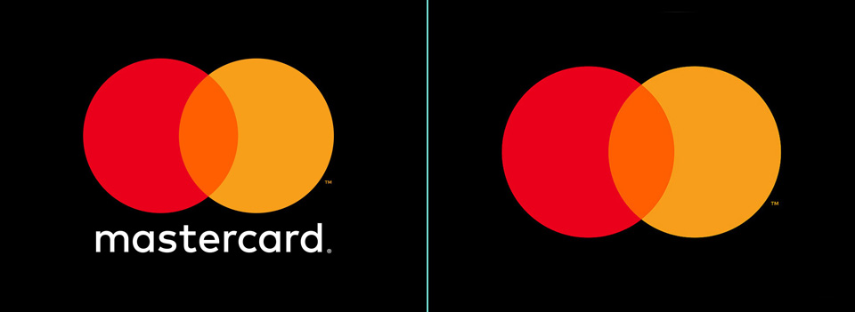
An updated, modernised logo was revealed back in 2016 but in 2019 the Mastercard logo was further simplified by dropping its name from its iconic brand mark for many applications. The interlocking red and yellow circles, referred to as the Mastercard Symbol, now stands on its own across cards using the red and yellow brand mark.
“The Mastercard Symbol represents Mastercard better than one word ever could, and the flexible modern design will allow it to work seamlessly across the digital landscape. Reinvention in the digital age calls for modern simplicity,” said Raja Rajamannar, chief marketing and communication officer at Mastercard. “And with more than 80 percent of people spontaneously recognizing the Mastercard Symbol without the word ‘mastercard,’ we felt ready to take this next step in our brand evolution. We are proud of our rich brand heritage and are excited to see the iconic circles standing on their own.”
The iconic red and yellow interlocking circles have been the hallmark of the Mastercard brand for more than 50 years, symbolizing the brand’s promise to connect people to ‘Priceless possibilities’ and portrays trust.
“We live in a time where, increasingly, we communicate not through words but through icons and symbols. Mastercard has had the great fortune of being represented by two interlocking circles, one red, one yellow, since its founding in 1966, said Michael Bierut, partner at Pentagram. “Now, by allowing this symbol to shine on its own, Mastercard enters an elite cadre of brands that are represented not by name, but by symbol: an apple, a target, a swoosh.”
Summary: retains brand heritage, reliance upon the icon, modernised, simplified to the extreme.
Lotus
Norfolk-based Lotus unveiled a revised version of its logo late in 2019 as it continues its reinvention since being bought by Chinese firm Geely.
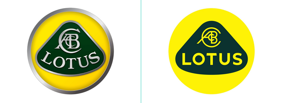
The famous roundel was first used in 1948 when it was founded by Colin Chapman. The new logo, which is now the brand’s eighth version, retains the heritage of the classic design while adding a fresh and modern approach. The classic British Racing Green and yellow colours are updated and the font is now a sans-serif making the lettering simpler and cleaner.
Marketing chief, Simon Clare, said the firm “looked back at the original Lotus roundel and thought about Colin Chapman’s philosophy: to simplify and add lightness.”
Summary: evolution not revolution, simplified, a modern company with heritage, ready for the future.
BT
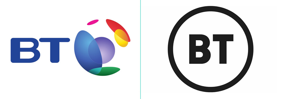
BT has received more than its fair share of criticism since it was privatised in the 1980s for the number of times they have rebranded, including the controversial Piper/Mercury logo and the Globe variants. This new logo has been under development for a few years and was revealed in Autumn last year. It’s a very simple design, featuring the letters BT in a circle.
“Our CEO has been very clear that the new mark symbolises real change. Making every BT employee a shareholder in the company is the first step towards transforming BT into a national champion that exceeds our customers’ expectations.”
The challenge with the new logo is that the company is no longer specific to the telecoms industry and now has to reflect both their current and future offerings including BT broadband services, sports channels and corporate products. While the new logo is very functional, simple and recognisable, it lacks emotional connection with the customer and doesn’t say much about the brand, their character or their offering.
Summary: a complete new look, stark, direct, minimal.
Volkswagen
The new look Volkswagen started when Herbert Diess took charge of the company at the end of 2018 in the wake of the Dieselgate scandal. The Transform 2025+ plan was created which resulted in a number non-profitable models being axed and a shift in focus towards electric cars in order to meet the new EU 95g/km emission targets along with substantial investment in digitisation and efficiency.
VW sales chief Jurgen Stackmann said: “The brand is undergoing a fundamental transformation towards a future with a neutral emission balance for everyone. Now is the right time to make the new attitude of our brand visible to the outside world.”
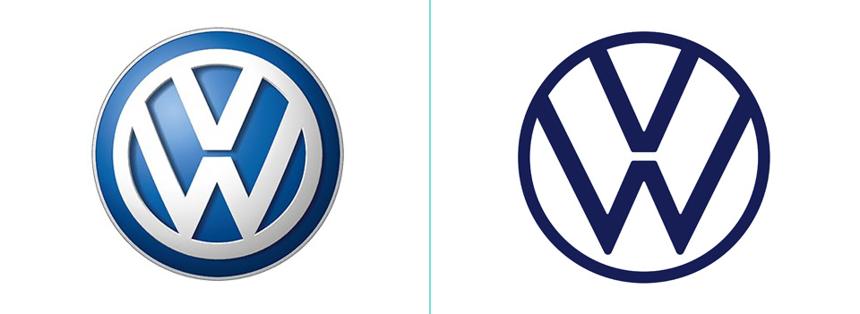
Unveiled at the launch of the new electric ID3 car, the new branding reflects the start of a new era while retaining the instantly recognisable look and feel of the original logo. The new logo is a two-dimensional design with thinner lines which allows it to work better on digital platforms. The letter W no longer touches the bottom of the outer circle. Colour usage will be flexible for example with the logo appearing in red on future GTI cars.
For a company the size of VW, introducing a new logo is a big undertaking. They estimate that around 70,000 logos will need to be changed at more than 10,000 dealerships and service facilities in 154 countries.
Summary: evolution, subtle, flat, instantly recognisable.

Discovery Channel
Since it’s launch back in 1985, The Discovery Channel (now called simply Discovery Channel) has had a number of logos, all featuring a globe image. April 2019 saw the launch of the ninth version for the brand.
Last redesigned in 2016, the new logo (created by Roger, an LA-based design agency) adds more weight to the name with less focus on the globe. The globe is also simplified, flattened and sits in middle of a stylised letter ‘D’. The font is now a modified version of Sharp Sans Extra Bold. The ‘D’ and the globe will also be used on their own as an icon device. A new tagline – ‘The World is Ours’ – also features.
Summary: more coherent and together, easier to use across all media platforms, contemporary.

Yahoo!
Yahoo! was a pioneer of the internet and a giant in the 1990s. Launched in 1994 it quickly became the go-to search engine and email provider. Unfortunately other companies quickly took over as favourites.
In 2017 the struggling company was bought by Verizon Communications and soon rebranded. In September 2019 the news site, search engine and email provider launched a new identity. The new logo was designed by New York based Pentagram and uses a chunkier sans-serif font for greater presence and legibility.
The single colour lower-case logo is much cleaner and more coherent. The exclamation point follows the same angle as the letter ‘y’ which is a nice touch. The proportions are much better that the previous spindly version.
Summary: bolder, more confident, greater impact, modern.
John Lewis/Waitrose
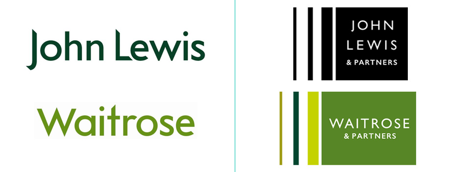
OK, I’m cheating a little here. The John Lewis Partnership rebranded their two companies at the end of 2017 but they’re still worthy of a mention in terms of what 2020 holds for brands. I think the John Lewis and Waitrose logos (designed by London-based Pentagram) demonstrate perfectly that subtle tweaks can have a big impact on modernising a logo and keeping a brand relevant going forward into the ‘20s. It will be interesting to see how it helps one of the last surviving department store chains.
Interesting to see that this rebrand actually did the opposite to what other brands are doing with there logo design – more text was added and a coloured shape was used as a holding device. The biggest change to the logo was the addition of the word ‘partners’ which reflects the fact that their staff are partners in the business and adds a sense of community.
Summary: less corporate, more sophisticated, less traditional focus, more scope for larger branding.
So what logo design trends will we see in 2020?
Less is definitely going to be more. In a word: simplification. Expect to see:
- Flatter logos without drop shadows, bevels, embossing, gradients or shading.
- Clean lines and basic shapes, crisp and uncluttered.
- Sans serif fonts will be the typefaces of choice, bringing a crisp, contemporary, modern approach to the decade. Serif fonts will be used for more traditional applications and logos.
- The end of the ‘outer shape’. Logos will be free from coloured backgrounds, shapes and holding devices allowing them to be used across a much wider range of digital media and devices.
- Structured and ordered layouts rather than quirky and chaotic and quirky angles. We’ll see structure and clean lines instead of curves and overlaying blobs.
- Monotone. Single colours in contemporary palettes or just black and white.
Are logos getting too simple? Does minimal design now have a stronger voice in today’s overcrowded visual world? What do you think? Tweet me!

